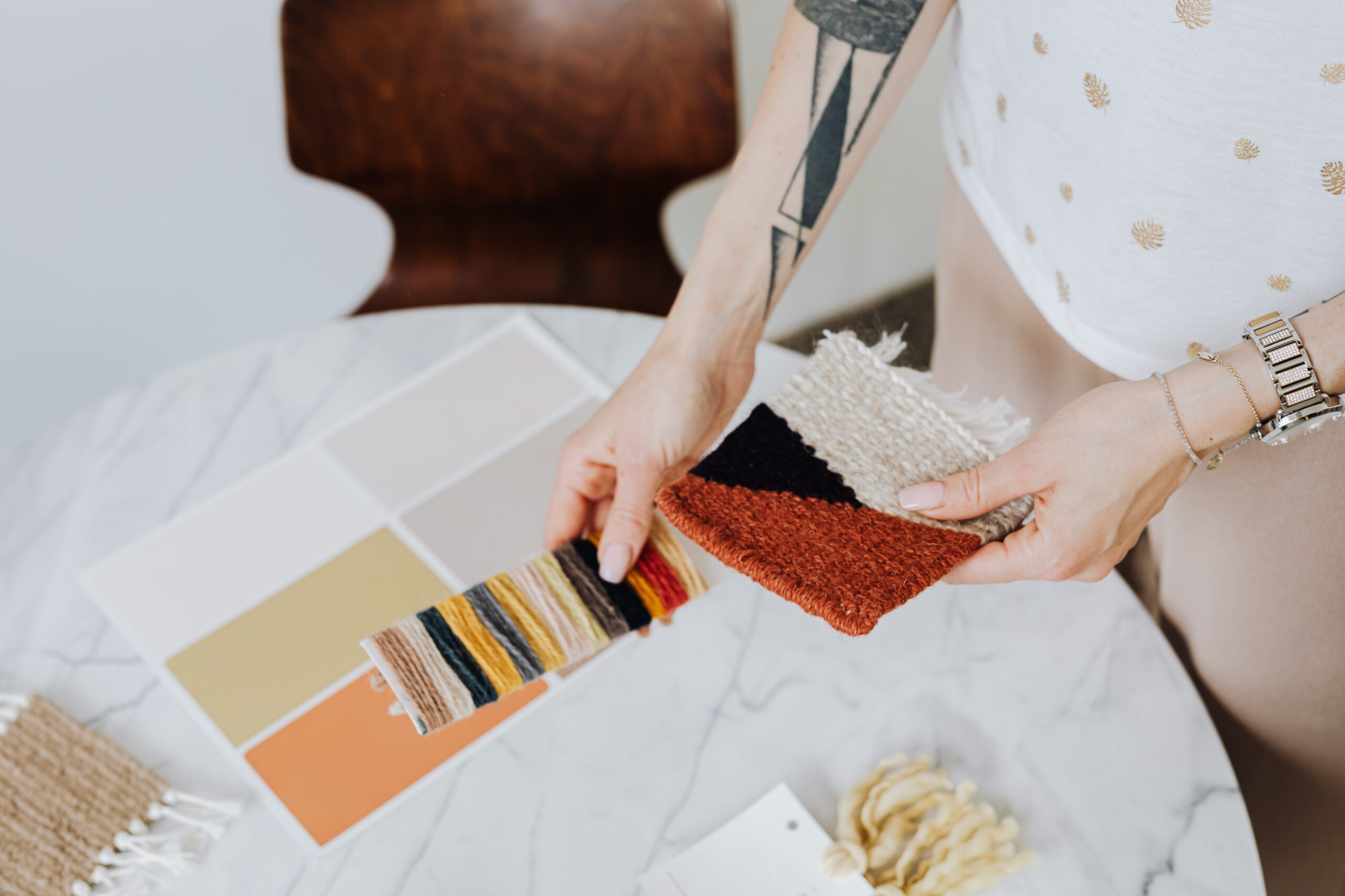
Hello, Hearth and Highlight readers! Are you planning to give your space a refreshing makeover or a subtle uplift? One of the simplest yet most impactful ways to revitalize your home is through paint. The right paint color can transform any room into a cozy, inviting space or a vibrant, energizing area. The world of color is fascinating, but sometimes the most impactful hues are understated. Neutral paint colors — think whites, beiges, greys, and taupes — offer versatility, serenity, and a timeless quality that’s hard to beat. Let’s explore the benefits of choosing neutral paint colors and how to incorporate them into your home.
Benefits of Neutral Paint Colors
- Versatility: Neutrals essentially provide a blank canvas, opening a world of possibilities for your home décor. They match virtually any color, making changing your furniture or accessories easier without worrying about clashing hues.
- Timeless Appeal: Trends come and go, but neutrals always remain in style. Whether you prefer a modern or classic look, neutral colors enhance various interior design styles effortlessly.
- Visual Spaciousness: Light-neutral colors reflect more light, making your space seem larger and brighter.
- Tranquility: Neutrals are calming colors that create a peaceful, relaxing ambiance — perfect for creating a serene home environment.
Incorporating Neutral Colors in Your Home
- Living Room: Opt for warm neutrals like beige or taupe to create a cozy and inviting space. For a modern touch, try using different shades of gray.
- Bedroom: Creamy whites and soft grays can create a soothing, peaceful environment conducive to relaxation and sleep.
- Kitchen: Whites and light grays are popular kitchen colors, providing a clean, fresh look. Pair them with a bold-colored backsplash for a pop of color.
- Bathroom: Light neutrals can make a small bathroom appear larger and brighter.
- Accent Walls and Furniture: If you love color but want to maintain a balanced look, consider using bold hues for accent walls or furniture in a neutral-colored room.
Color Ideas for Your Home
Aegean Teal (Benjamin Moore 2136-40)
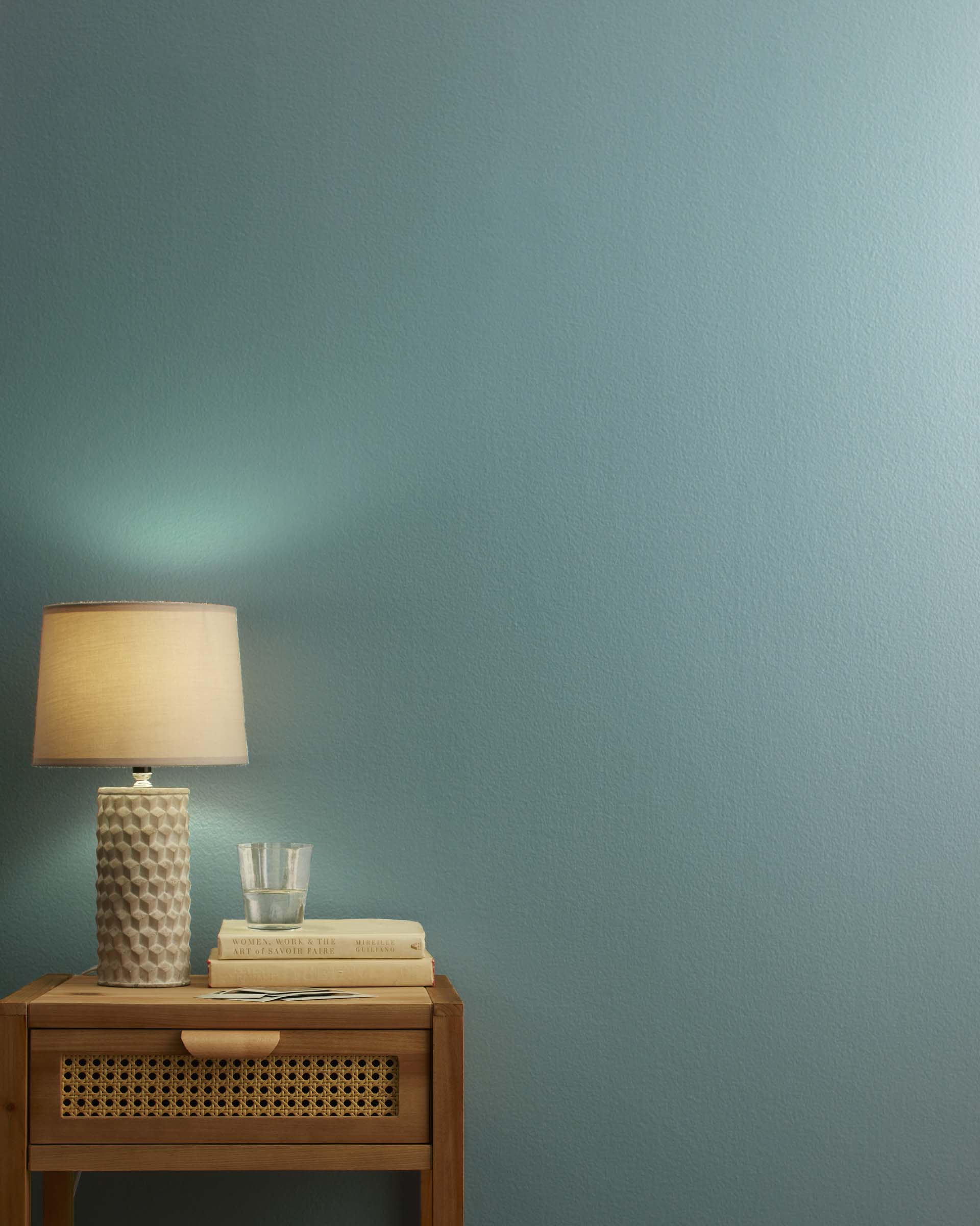
photo by Benjamin Moore
This intriguing blue-green blend is both calming and uplifting. Its serene tone makes it perfect for bedrooms and bathrooms where tranquility is essential. Pair it with white or cream accents for a timeless, classic look or with bold yellows and pinks for a more contemporary aesthetic.
Iron Ore (Sherwin Williams SW 7069)
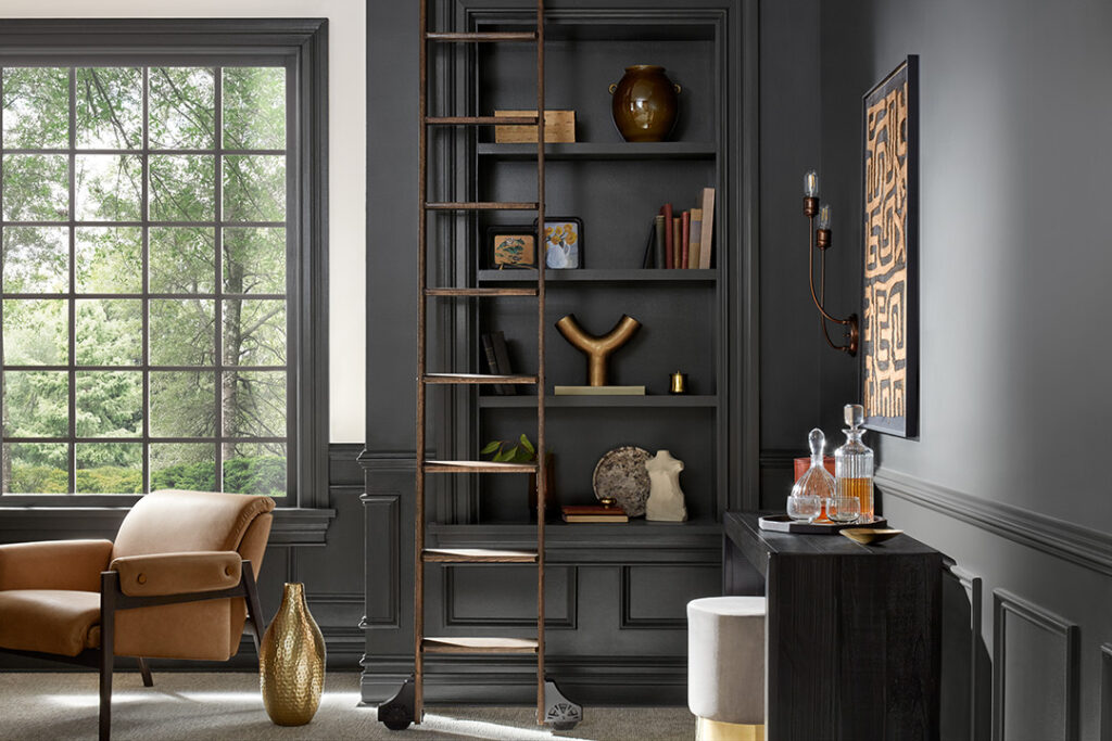
photo by Sherwin Williams
Iron Ore is a rich, dark gray with a subtle metallic undertone that mimics the natural color of minerals found in the earth. This dramatic and versatile shade adds depth and sophistication to any space, making it an excellent choice for an accent wall in a living room or study. Iron Ore pairs beautifully with lighter neutrals for a striking contrast, or with earthy hues for a harmonious, nature-inspired palette.
Redend Point (Sherwin Williams SW 9055)
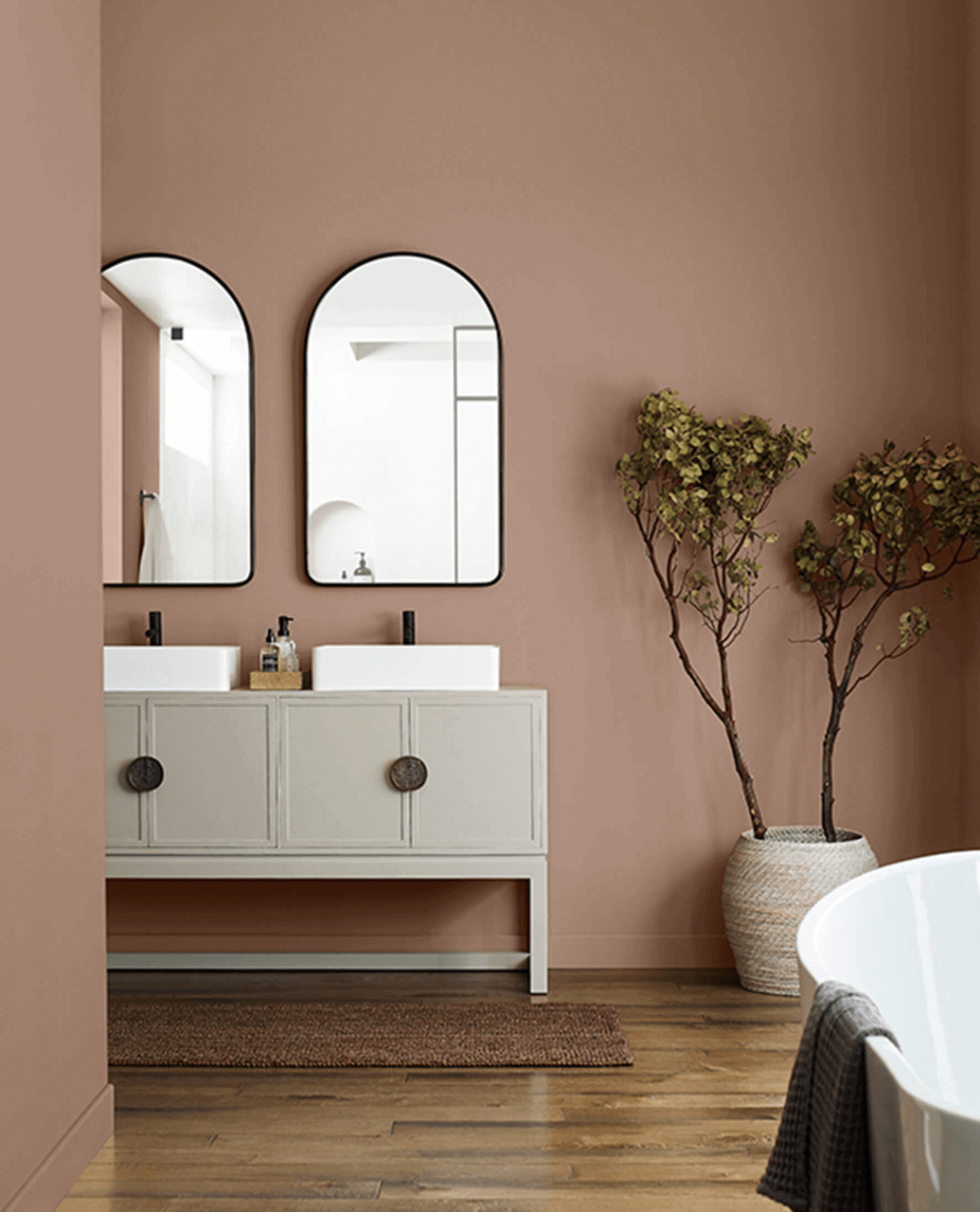
photo by Sherwin Williams
Elegant and refined, Redend Point is a warm, muted red that creates an inviting atmosphere. It’s a wonderful choice for dining rooms, entryways, or even accent walls where you want to make a bold statement. Pair it with soft neutrals like beige, cream or white to create a timeless look.
Stonington Gray (Benjamin Moore HC-170)

photo by Benjamin Moore
As its name implies, this is the ultimate neutral. This versatile shade can serve as the perfect backdrop for any color palette, making it ideal for living rooms, hallways, or kitchens. Pair it with brighter hues for a pop of color or with other neutrals for a more subdued, minimalist vibe.
Slate Tile (Sherwin Williams SW 7624)
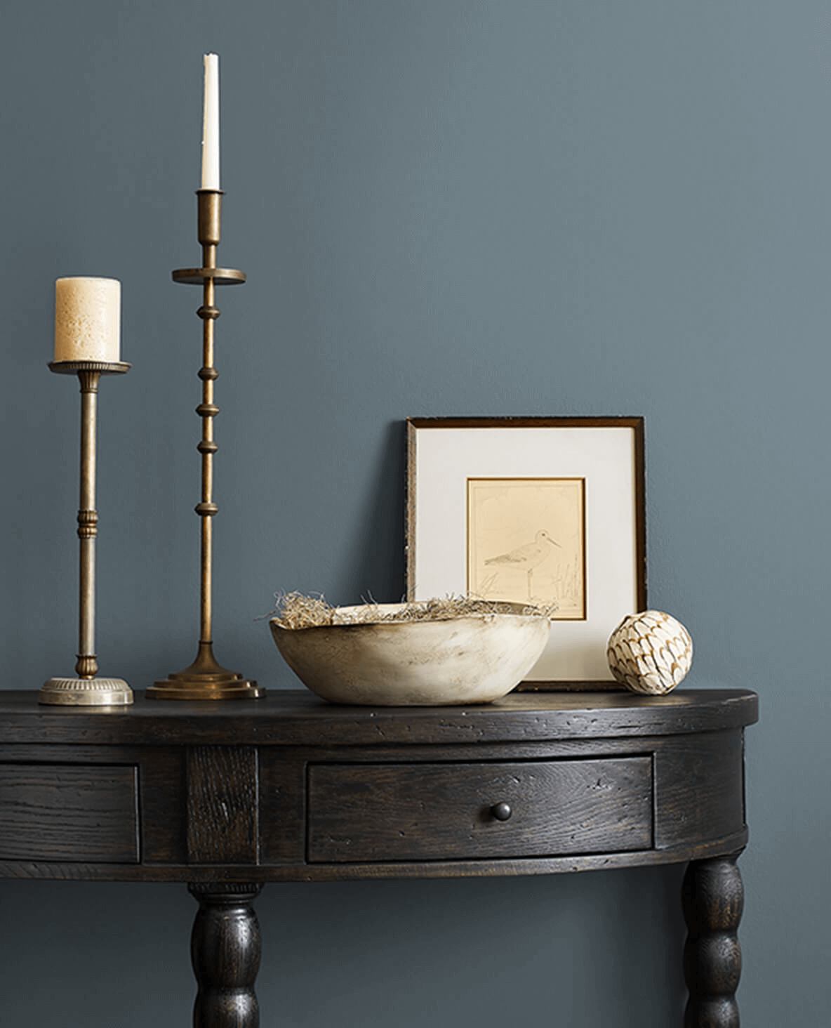
photo from Sherwin Williams
Evoking the natural beauty of a cool, misty morning, Slate Tile is a sophisticated shade of grey-blue that brings a tranquil ambiance to any room. It’s an excellent choice for spaces like the living room or study where a peaceful yet elegant atmosphere is desired. The versatile Slate Tile complements a broad range of palettes, aiming for a modern minimalistic look with whites and blacks or a more rustic appeal with browns and earthy tones.
Silver Cloud (Benjamin Moore 2129-70)

photo by Benjamin Moore
Silver Cloud is a light, airy gray with a cool undertone that brings fresh air to any space. Its soft, tranquil vibe makes it perfect for bedrooms, bathrooms, or any room where you want to create a calm, serene atmosphere. Pair Silver Cloud with crisp whites for a clean, minimalist look or bold colors like navy or plum for a pop of contrast and drama. This versatile shade seamlessly integrates with various décor styles, from contemporary to coastal.
Color can profoundly impact our mood and perception of a space. Experimenting with these neutral paint colors from reliable manufacturers like Benjamin Moore and Sherwin Williams can help you create a stylish home that reflects your personality. Remember, neutrals are far from boring. The key is to add different textures and patterns through your furniture, rugs, and accessories to keep the space dynamic and engaging. Neutral paint colors are smart for creating a flexible, timeless, and tranquil home. So, go ahead and embrace the tranquility that neutral colors bring!
Just remember, the best color for your home is the one that brings you joy.
Stay tuned to Hearth and Highlight for more home decor inspiration and tips! Until then, happy decorating!


![🍂✨ It’s Time for Thanksgiving Reflections! ✨🍂
Hey everyone!
Today, I’m inviting you to join a very special journey on my blog - “A Thanksgiving to Remember: Embracing the Bittersweet Beauty of Change.” This year, Thanksgiving is more than just a holiday; it’s a reflection on life’s fleeting moments, the ‘lasts’ that sneak up on us, and the joy of new beginnings.
👩👧👦 Whether it’s the nostalgia of past Thanksgivings, the thrill of new traditions, or the bittersweet feeling of an empty chair at the table, we all have stories that make this time of year unique.
➡️ Read the full post [Link in Bio and Story] and let’s share the warmth and wisdom this season brings.
📲 I would love to hear from you – your traditions, memories, and what Thanksgiving means to you. Let’s make this Thanksgiving one for the books!
#ThanksgivingMemories #ShareYourThanksgiving #FamilyTraditions #BlogPost #HeartfeltStories #KidsGrowUp #HolidayAfterLoss](http://hearthandhighlight.com/wp-content/plugins/instagram-feed-pro/img/placeholder.png)